Design
The full website's six designs, light or dark, your colour, the background behind your bot's picture, and your own fonts.
You set your site's look on BotPanel > Website > Design, under the layout. The preview shows each change as you make it, and visitors see it when you press Save.
The colour, the picture background and the fonts work on every layout. The designs and light or dark are for the full website.
Designs
The full website comes in six designs. Each one lays out the same pages and settings its own way, so you can switch any time without losing anything.
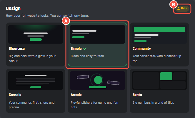
Website > Design > Design
- A A design: a small drawing of it in your colour, its name and a line about it. The one you're using has a tick.
- B The plan chip at the top of the card. It reads Plus, or Beta while the beta runs. The designs need BotPanel Plus.
| Design | What it looks like | Light or dark to start |
|---|---|---|
| Showcase | Big and bold, with a glow in your colour | Dark |
| Simple | Clean and easy to read | Light |
| Community | Your server feel, with a banner up top | Dark |
| Console | Your commands first, sharp and precise | Dark |
| Arcade | Playful stickers for game and fun bots | Dark |
| Bento | Big numbers in a grid of tiles | Light |
Without Plus, the card is called Full website designs. Pressing a design shows the full website with it in the preview, but you can't save it. See Templates and layouts.
Light or dark, colour and picture background
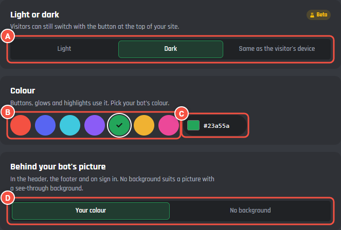
Website > Design, under the designs
- A Light or dark: Light, Dark or Same as the visitor's device.
- B Colour: seven ready colours.
- C Any other colour: press the square to pick one, or type its code, like
#f45142. - D Behind your bot's picture: Your colour or No background.
Light or dark
Until you pick, the site uses the design's own (see the table above). Same as the visitor's device follows each visitor's light or dark setting and changes with it.
Visitors can still switch with the light and dark button at the top of your site, and their browser remembers what they picked. You can hide that button on the Navigation tab (see Buttons at the top right).
Light or dark needs BotPanel Plus and only shows on the full website. Each one page layout has its own fixed look.
Colour
Buttons, glows and highlights use your colour. The ready ones are Red, Blurple, Cyan, Violet, Green, Amber and Pink. For any other colour, use the picker or type a six digit code with a #. A code that isn't a colour turns the field red and stops the save.
The site works out whether white or near black text reads better on your colour, so a pale colour still has readable buttons.
Behind your bot's picture
Your bot's picture shows in the header, the footer and on the sign in page.
- Your colour: your colour behind it.
- No background: the picture on its own. Use this when your bot's picture has a see-through background.
Fonts
Pick your own fonts for headings and for text, from Google Fonts. This works on every layout.
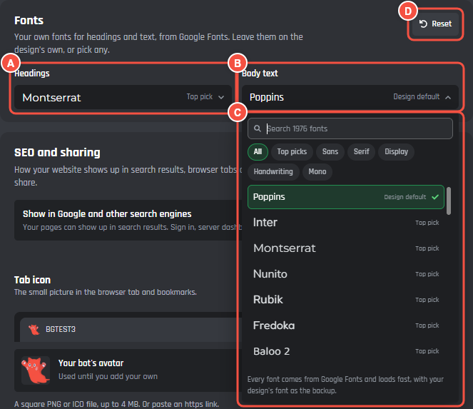
Website > Design > Fonts
- A Headings: the font for titles and headings.
- B Body text: the font for everything else.
- C The list: search by name, or narrow it to Top picks, Sans, Serif, Display, Handwriting or Mono. The first row is the design's own font, marked Design default.
- D Reset puts both back to the design's own. It shows once you've picked a font.
Each font loads from Google Fonts, with the design's own font as the backup while it loads. Until you pick, each design uses its own:
| Layout or design | Headings | Body text |
|---|---|---|
| One page layouts, Showcase, Simple, Community | Rajdhani | Poppins |
| Console | Inter Tight | Inter Tight |
| Arcade | Fredoka | Nunito |
| Bento | Space Grotesk | Manrope |
Your picks stay when you change design. A template sets its own fonts when you apply it.